Last week was a busy week as I spent most of it implementing and tweaking the really basic tutorial system I had in mind for Tilt To Live. From my gameplay experiences I feel tutorials have gotten pretty good at being integrated into the game themselves and not being ridiculously wordy/boring. I’m not sure if it’s that I tend to grok how most genre game mechanics work from many years of playing, or understand the basic ‘standards’ across games in the same genre, or that the tutorials are really getting better. I tend to be optimistic about it though and hope we are progressing :). When I was designing the tutorial system for Tilt To Live (which isn’t anything special, but I did sit down and give it a bit of thought) I started thinking from a more general game design perspective on what to consider in such a system:
How complex is thy game?
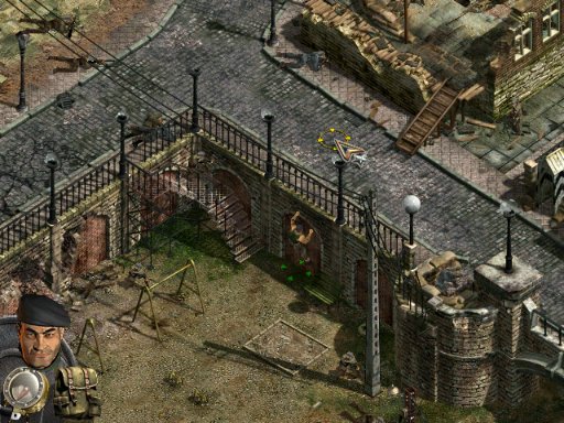
I generally pay attention for first few minutes of tutorials to learn the essential controls then I barrel forward into the game hoping for the best. Some tutorials overstay their welcome. It really comes down to distilling the core gameplay experience and then getting the user to run through those motions quickly and keeping it engaging. Of course it’s really hard to get around that if you’re game is as complex as say…Commandos 2.
Commandos 2 may be the most ferociously complicated game released yet for Xbox. – 1UP

Sometimes there just isn’t getting around that boring part of the tutorial if your game really IS complex and there are a lot of rules required to know before you can make your first move. For sufficiently complex games, tutorials are a huge part of the game design problem. When I played commandos I pretty much lost interest after 15 minutes futzing around in the training missions. Another tale of a lost player due to a lengthy and uninteresting tutorial :(. And this was even with a friend of mine who was a huge fan of the game pretty much holding my hand through the first couple of missions. It just didn’t click with me, but I like to think that the ‘fun’ of the game was lost on me.
Yet, lengthy tutorials are common in non-video game settings. Take contract bridge for instance. I learned to play it with several co-workers and if you gave me a manual and several self-paced tutorials I probably would have never figured it out (particularly the bidding system). Call me dumb, but I like to think I’m just lazy ;).

The difference in me learning how to play bridge vs taking the time to play commandos 2 was that the “tutorial” was integrated into the very game itself in a way. I wasn’t playing “Tutorial: Bridge” like I was playing “Tutorial: Commandos 2”. I was playing full non-handicapped bridge and learning at the same time. It was a constant learning process. It was a fun process of discovery, which for some odd reason didn’t come across to me in Commandos 2. The rules of the game don’t spoon-feed you tactics and how to ‘win’ at bridge. Also the ‘engaging’ part was from talking to the other players in the game to learn more. Not many tutorial systems beat social interaction. I’m certainly not the only one that enjoys learning how to play a game through other enthusiasts. Juuso, of GameProducer.net recently had similar thoughts:
I like how Zombie Panic has no tutorial, nor much hints at all. Instead, players ask each other “how you rotate the board”. In Zombie Master (for some reason I’m getting zombie game examples here) it’s cool how players ask each other “what to do next?” – sometimes the reply is “n000b!” but often time other people tell what to do. I think that’s tutorials in its greatest form: community interaction where everybody helps each other. People can enjoy the game in many different levels.
In essence, the more complex your game rules are you may be more justified to put in a longer tutorial. But you need to ask yourself, particularly if you’re an indie focusing on smaller games, is your tutorial system teaching the player the game rules (Bridge) or is the tutorial holding their hand while they play a bunch of throw away levels (Commandos 2 and a lot of single player games)?
Who art THOU?
These days, no amount of tutorials will get a player who is casually interested in your game but doesn’t grok the necessary control schemes to talk in that game’s “language”. By language, I mean FPS, RTS, or RPG relevant control schemes. Each genre of games kind of have set standards on how to play that particular game. I’ve pretty much concluded that my mother, at her current age and interest level, will never be able to pick up Halo 3 and learn to play it competently. Not because I don’t believe she doesn’t have the ability (lol), but simply because she doesn’t care enough about it to invest the time and energy to become familiar with that system. Give her bejeweled 2 on the other hand and omg…we’ve lost contact…for hours. On the other hand, any hardcore gamer can take any FPS shooter, run through a brief tutorial on what is different about this shooter than others and proceed to play.
Casual games have picked up on that sensibility (for the most part), and keep tutorials pretty minimal but make very few assumptions about the player from what I recall. The good iPhone games tend to be doing a decent job at conveying play mechanics quickly and efficiently, because the audience is mobile. Some opt for a simply ‘how to play’ button but offer no in-game advice, while others do the opposite.
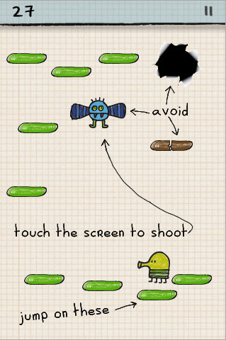
I chuckled to myself when I realized the brilliance of Doodle Jump’s aesthetic, intentional or not. They were able to literally pencil in the tutorial in the background as you play and not break the “mis-en-scene” (hah, how’s that for artsy?) of the game.

In Practice
So, when it came to implementing a tutorial system for Tilt To Live I had the answers to the above two questions along with some other notes:
- How Complex is the game? Mechanically, it’s dead simple. Actual difficulty of getting a reasonably high score? Currently, results may vary. The resulting tutorial system should be either a)extremely minimal b) non-existent.
- Who are YOU? While the game has obvious influences from more hardcore 360 shooters, I wanted to tone down the difficulty, give a more approachable aesthetic, and try to reach a less hardcore audience. The resulting tutorial system shouldn’t assume too much of the player’s previous gaming knowledge. This influences the terminology you use in tutorials and other text.
- Appealing to the Core Ideas of the game: One of the core ideas of Tilt To Live is to keep it as minimal and simple as possible. Right down to the title, which serves almost as a tutorial in itself.
Adam and I kind of went back and forth on whether a game as simple as Tilt To Live really needed any explanation. I mean the title pretty much says it all for goodness sake. I persisted and decided even a brief explanation of at least one of the game rules (collecting pick ups to attack enemies) should get an explanation. We eventually came up with this (a work in progress video):
So the player on the first launch of the game is informed of the general rules of the game but control is never taken away from them as they can freely play the game. This gives the first time casual player some time to get acclimated to the game’s controls and then proceed as normal.
We’re still up in the air about a “How To Play” option that would give more detail on the power ups and mechanics. I figured no one would give a damn about the option, especially after seeing a few other iPhone games. It all points back to the complexity of the game. It doesn’t necessitate the explanation of all the power ups. Plus discovering what each one does is part of the fun :). Additionally, I will cut anything from the main menu as long as it doesn’t make it more difficult to get to information you want in order to keep in line with point #3 above. So I’m leaning towards removing it all together, but I’m not completely done iterating on it so it may change….