Early on in the development of SFT I had concerns about how I was going to do text rendering on the cards in such a way that things stay readable regardless of resolution, while keeping fonts looking nice. I ran into aliasing issues as well as pixelation, since all the fonts being rendered were simply bitmap textures on top of cards that are flipping, rotating, and scaling in 3D space. I had read about SDF (signed distance fields) font assets for text rendering and was wanting to get something implemented for SFT’s cards. But alas, I had to temper my eagerness to “learn something new and cool” and focus on getting the game done.
So in the end, I opted to use Unity’s built-in font rendering, along with NGUI’s nice text layout and rendering tools, and tuned the distance of cards from the camera in the different UI screens to make sure everything stayed “more or less” readable in as many cases as possible on as many resolutions as possible. This worked well for the rest of production and I think we have a very shippable solution for card text in SFT.
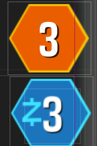
A couple of weeks ago I ran across this Unity asset called Text Mesh Pro. It had SDF font rendering! I poked around with it for a bit as it was a very easy library to just drop in and start rendering text in the game:

The top number is rendered with Text Mesh Pro. The bottom with a combination of Unity fonts + NGUI UILabels. The difference is stark. Now in practice, I think most wouldn’t even notice. The UI in SFT was minimized to the best of our ability to make sure the limitations of the fonts didn’t draw attention to themselves. Sure enough, it was hard to tell in SFT unless you were looking and had both builds side by side. It was a definite improvement, but I think in future projects using SDF fonts will make me less weary of using thin or very large typography. Even if the visuals aren’t miles ahead, the big win here is memory savings. Instead of having huge font atlases with 200pt fonts to keep things crisp, a single small SDF atlas is all that’s needed for any point size, and in the case of the TMP asset, any style.
This is one of the things Unity gets right. The font rendering asset that Digital Native Studios put together represents probably hundreds of man hours. I simply couldn’t justify that kind of time for our game on just text rendering, despite it being arguably an important part of a card game. If I wanted to do that for any piece of “core” technology in any given game, we’d be measuring our development time in years, not months. Sadly, we can’t afford that kind of time. Instead, I made use of the tools we had at the time (which were good for the most part), and alter the game’s aesthetic to match with what we were capable of. Being able to go and drop in a new library for font rendering and immediately benefit from it after 20 minutes of work + a few bucks vs hundreds of hours is impressive. Hats off to the developer behind this nice little tool!